mask-border-slice
The mask-border-slice CSS property divides the image set by {{cssxref("mask-border-source")}} into regions. These regions are used to form the components of an element’s mask border.
Syntax
/* All sides */
mask-border-slice: 30%;

/* top and bottom | left and right */
mask-border-slice: 10% 30%;

/* top | left and right | bottom */
mask-border-slice: 30 30% 45;

/* top | right | bottom | left */
mask-border-slice: 7 12 14 5;

/* Using the `fill` keyword */
mask-border-slice: 10% fill 7 12;

/* Global values */
mask-border-slice: inherit;
mask-border-slice: initial;
mask-border-slice: revert;
mask-border-slice: revert-layer;
mask-border-slice: unset;
The mask-border-slice property may be specified using one to four <number-percentage> values to represent the position of each image slice. Negative values are invalid; values greater than their corresponding dimension are clamped to 100%.
- When one position is specified, it creates all four slices at the same distance from their respective sides.
- When two positions are specified, the first value creates slices measured from the top and bottom, the second creates slices measured from the left and right.
- When three positions are specified, the first value creates a slice measured from the top, the second creates slices measured from the left and right, the third creates a slice measured from the bottom.
- When four positions are specified, they create slices measured from the top, right, bottom, and left in that order (clockwise).
The optional fill value, if used, can be placed anywhere in the declaration.
Values
{{cssxref("<number>")}}- : Represents an edge offset in pixels for raster images and coordinates for vector images. For vector images, the number is relative to the element’s size, not the size of the source image, so percentages are generally preferable in these cases.
{{cssxref("<percentage>")}}- : Represents an edge offset as a percentage of the source image’s size: the width of the image for horizontal offsets, the height for vertical offsets.
fill- : Preserves the middle image region. Its width and height are sized to match the top and left image regions, respectively.
Description
The slicing process creates nine regions in total: four corners, four edges, and a middle region. Four slice lines, set a given distance from their respective sides, control the size of the regions.
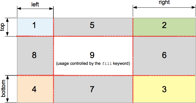
The above diagram illustrates the location of each region.
- Zones 1-4 are corner regions. Each one is used a single time to form the corners of the final border image.
- Zones 5-8 are edge regions. These are repeated, scaled, or otherwise modified in the final border image to match the dimensions of the element.
- Zone 9 is the middle region. It is discarded by default, but is used like a background image if the keyword
fillis set.
The {{cssxref("mask-border-repeat")}} , {{cssxref("mask-border-width")}} , and {{cssxref("mask-border-outset")}} properties determine how these regions are used to form the final mask border.
Formal definition
{{cssinfo}}
Formal syntax
{{csssyntax}}
Examples
Basic usage
mask-border-slice serves to define the size of the slices taken from the source image, and is used to create the border mask.
mask-border-slice: 30 fill;
Chromium-based browsers support an outdated version of this property — mask-box-image-slice — with a prefix:
-webkit-mask-box-image-slice: 30 fill;
[!NOTE] The
mask-borderpage features a working example (using the out-of-date prefixed border mask properties supported in Chromium), so you can get an idea of the effect.
[!NOTE] The fill keyword needs to be included if you want the element’s content to be visible.
Specifications
{{Specifications}}
Browser compatibility
{{Compat}}
See also
{{cssxref("mask-border")}}{{cssxref("mask-border-mode")}}{{cssxref("mask-border-outset")}}{{cssxref("mask-border-repeat")}}{{cssxref("mask-border-source")}}{{cssxref("mask-border-width")}}- Illustrated description of the 1-to-4-value syntax